Semsee – Project 1
Navigation & Form Redesign
Overview Semsee's platform helps agents quote across multiple carriers from a single entry point. As the product grew, it became clear that the core quoting form and navigation were creating friction — slowing agents down and making the platform harder to use at a glance.
The Challenge The goal was twofold: refresh the look and feel of the quoting form and navigation, and help agents move through the form faster and with fewer errors.
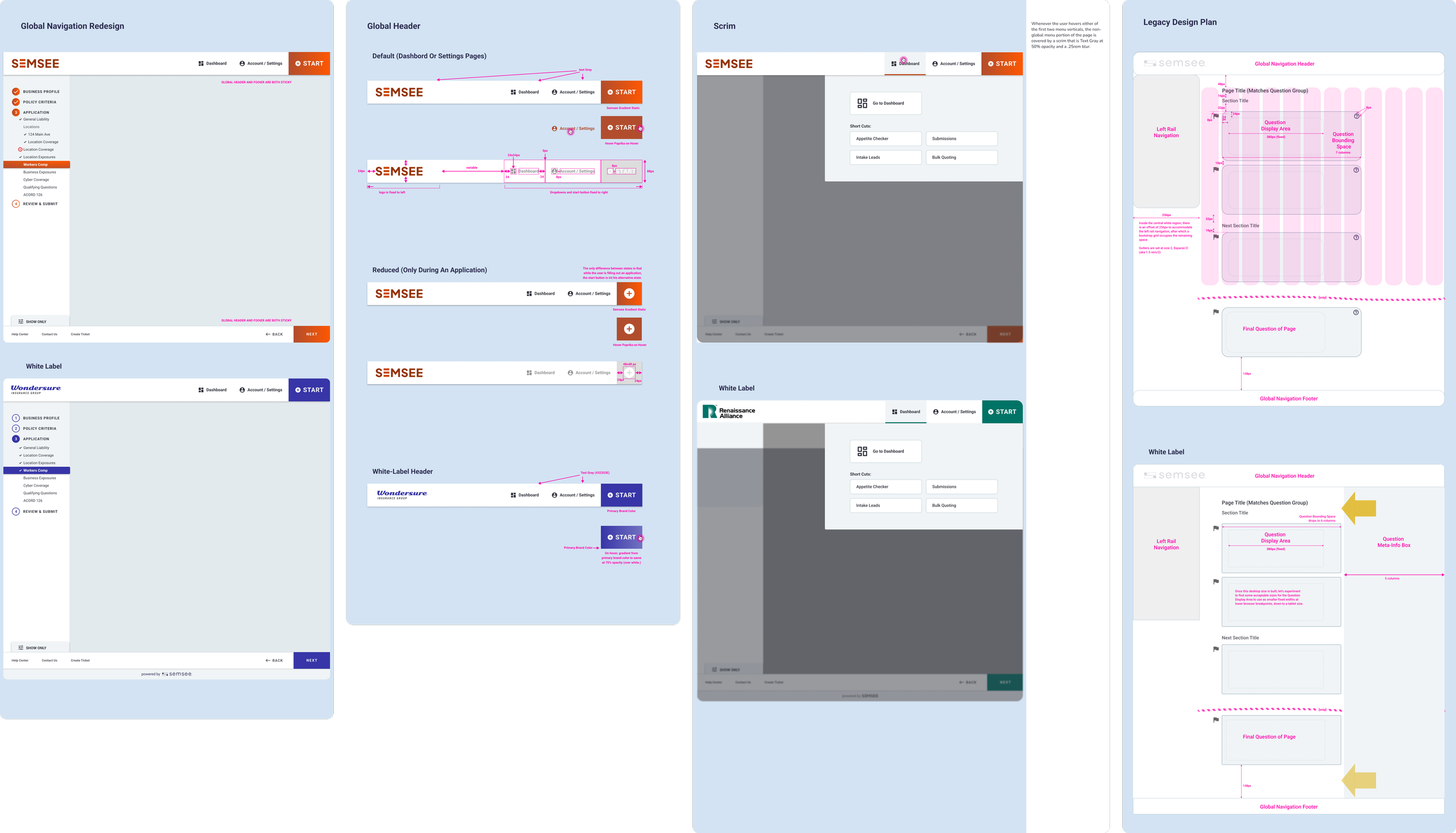
Discovery & Research The process started with a thorough audit of the existing form and navigation. Through UAT observations, we identified several recurring pain points: agents were struggling with an unintuitive icon-based navigation, there was no easy way to quickly start a new application, and help and resources were hard to find. For white-label partners, the absence of a visible logo placement was also a problem — branding consistency is critical when the product lives under a carrier or partner's name.
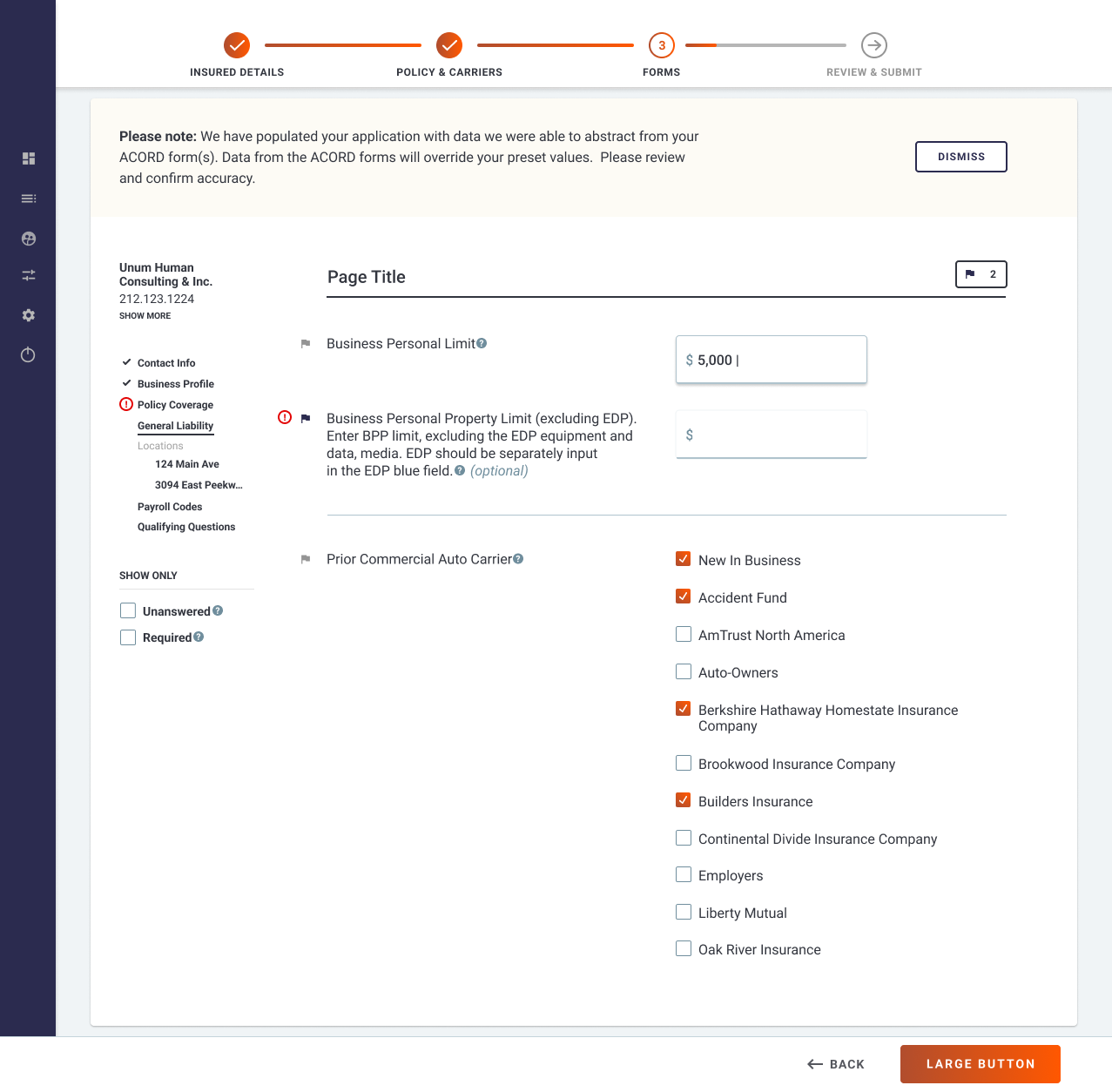
On the form side, research pointed to a single-column layout. A single-column form layout is backed by a strong body of UX research — it reduces mental load, improves completion rates, cuts down on errors, and simply helps people move faster. The existing layout worked against all of these.
Before
After
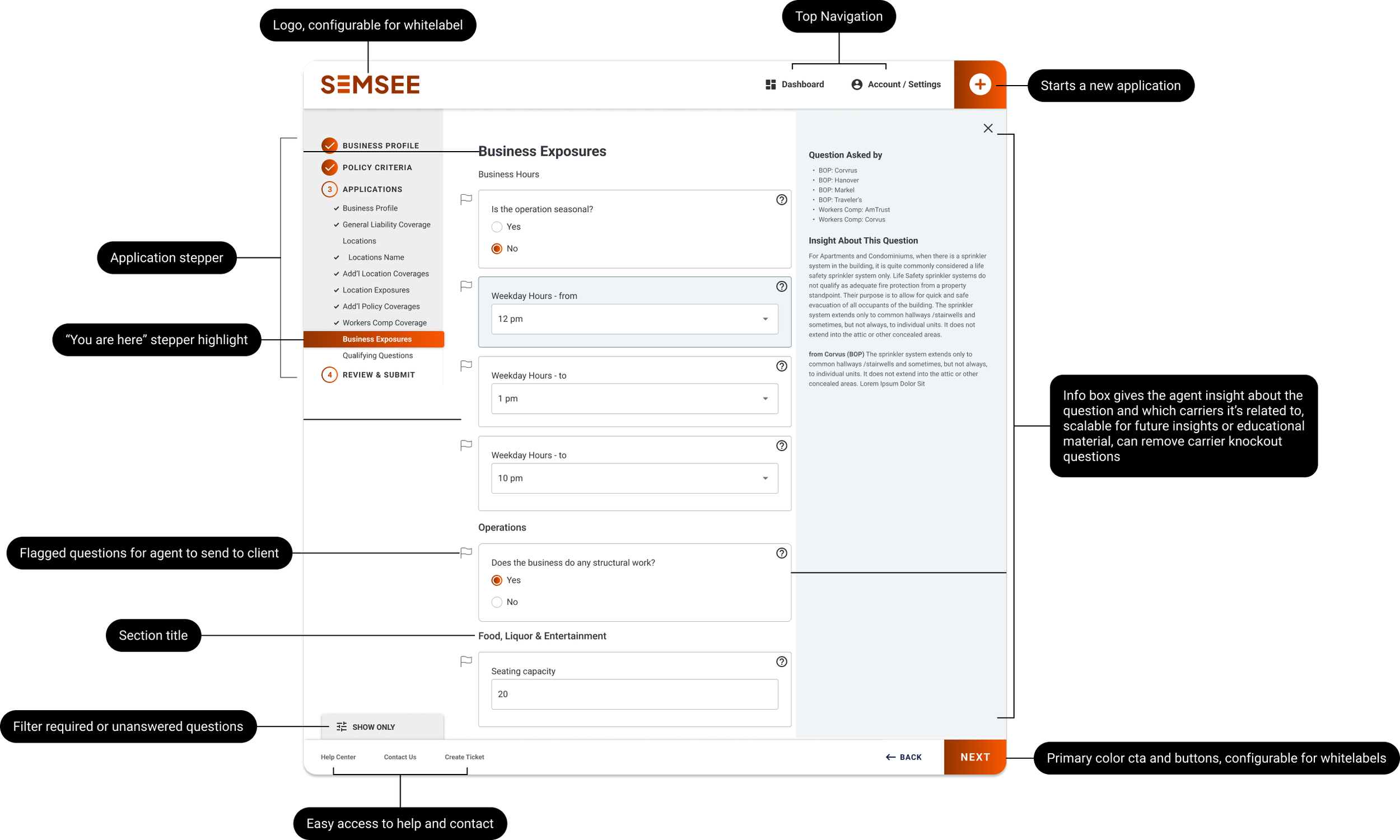
The Solution Working closely with a PM and the Head of User Experience, I translated these findings into a redesigned navigation and form experience. The navigation was restructured to replace ambiguous icons with clearer, more intuitive elements, a prominent logo placement was introduced to support white-label use cases, quick-start access for new applications was added, and help and resources were surfaced more accessibly.
The form was redesigned around a single-column layout — reducing visual noise and guiding agents through the entry process in a more focused, linear way.
Outcome The redesign addressed pain points across the board: agents could navigate the platform more confidently, form completion became faster and less error-prone, white-label partners had a cleaner brand presence, and stakeholders were aligned around a more polished, consistent product experience.
Documentation: